
UI Designer (Hardware)
Project Managers, Mechanical Engineers, Marketing PMs
During my time at SharkNinja, creator of the Shark and Ninja brands, I worked on a team to develop a user interface design for Shark’s first battery powered vacuum, Shark IONFlex DuoClean. Design team members for this project included Luis Canas (Senior Industrial Designer) and Marta Szpilewska (Design Strategist).
I was the Lead UI Designer for this project; all of the designs and visual renderings presented in this case study are my own work. Some of the iconography used in these concepts were developed by the Bresslergroup design consultancy.
Shark vacuums were mainly known for creating corded upright and stick vacuums. This was the company’s first cordless vacuum to be designed and developed in-house. The team's main objective was to create a 5 star experience that could compete against other cordless vacuums on the market.
Some questions we asked ourselves as we began our product development include:
Our engineering teams had already begun the development of internal components of the vacuum. The area on the rear side of the hand vacuum was reserved for the interface. The shape and existing architecture of the design prompted our team to explore options for implementing a dial mechanism. Our team conducted store audits to research different types of dial interfaces and how users interact with them.
At the early stages of our user interface ideation we actively explored ideas that would implement a dial mechanism. In these concepts we explored having different levels of power (5 levels, 3 levels, and 2 levels) and the option for different floor types.
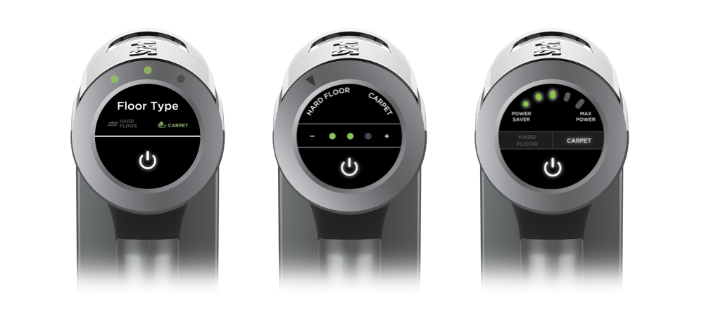
Due to the added cost, weight, and physical space needed to implement a dial mechanism, our stakeholders decided to move forward with a button panel instead of a dial during the next round of ideation.
We looked at different shapes and placements for the light indicators, as well as different placements for the power button and floor mode buttons.
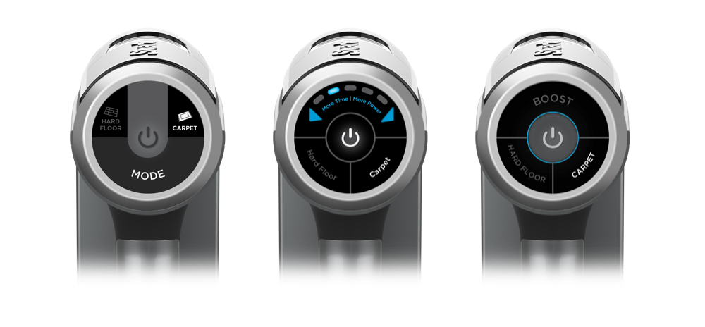
After several rounds of concept iteration, our marketing, engineering and design teams aligned on what features should be implemented onto the final UI design.
The final requirements for the interface were:
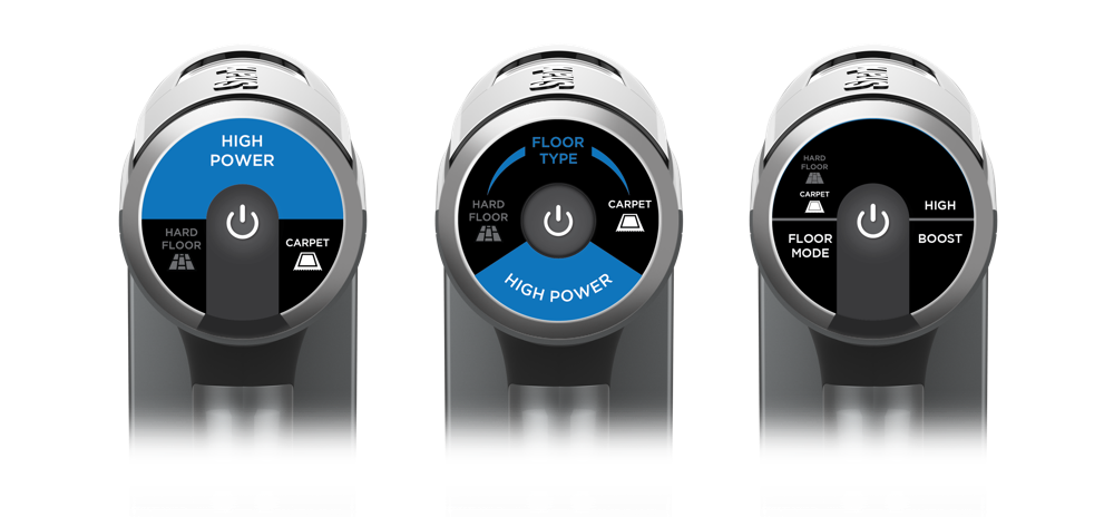
The final design for the user interface would implement a vertically located power button with two secondary buttons on each side. The left button will toggle between the two floor modes, and the right button will toggle between the two power levels.
By using this strategy, it allowed for almost 50% of the real estate of the interface to be reserved for iconography. It also simplified the overall experience for the user since the interface was only three buttons.
As we iterated through these final stage concepts, our team and myself built out high fidelity prototypes using the Flinto application. Our consumer insights and marketing teams conducted user testing with these prototypes as we moved forward with development.
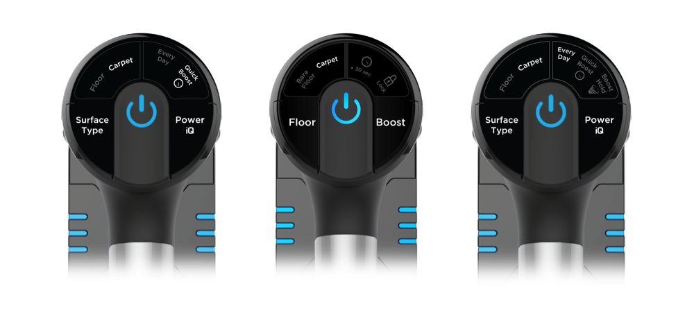
Shark IONFlex featuring DuoClean technology is the first cordless stick vacuum to be released from SharkNinja. The Shark IONFlex was released on the market in the Fall of 2017.
The final iconography used in the mass production for this product was developed by an outside graphic design consultancy.
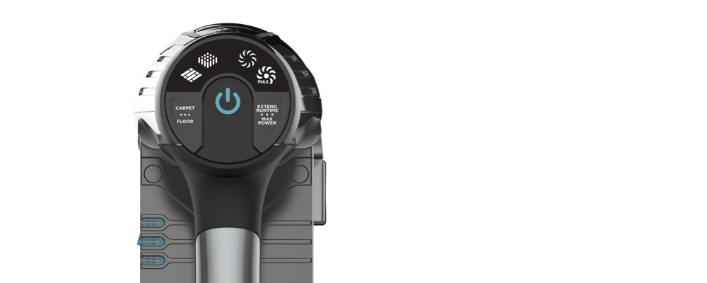
Working on this project during my time at SharkNinja has definitely been one of my proudest moments. Throughout the project we faced several challenges. Ultimately we implemented a design that is easy to understand for all users, even across different countries and languages!
After diving into some online reviews of the product, many Amazon reviewers call out the user interface directly:
Since the launch of this product in Fall 2017, the user interface design has been carried over to Shark ION™ F80 MultiFLEX® and Shark ION™ X40.
For any other questions about this project or anything else, please contact me at hello@joannajliu.com.